GigSky
Iterating a Travel eSIM Product, One Test at a Time
GigSky sells international eSIM data, and it's the only eSIM that works on 280+ cruise ships. For two and a half years I was its design team: the app, the web app, the marketing site, the App Store, the blog and the ads. Most of that work ran in a loop. We shipped, watched what travelers did, tested variants against each other, and revised. This case follows two threads through that loop: the Visa benefit, and the plan picker.
as GigSky's design team, product and brand, December 2023 to May 2026
the loop most of the work ran through: landing pages, the plan picker, App Store screens and ads, in rounds
the Visa benefit I designed opened to cardholders worldwide in May 2026
The challenge
A Small Team, a Lot of Surface, and No Room for Guessing
GigSky is a small company with a product that lives in a lot of places: an app, a web app, a marketing site, an App Store listing and ad campaigns, all of which have to agree with each other. There was no research team. The way to learn what travelers needed was to ship, measure and revise, so my job was to design each round well enough to learn from it, then carry what it taught across every surface.
Every surface had to agree
One Product in Five Places
A traveler meets GigSky in an ad, on a country page, in the App Store and in the app. If any of those described the product differently, trust went with it. Being the one designer across all of them was the only way to keep them in step.
Learn from each round
Ship It, Then Find Out
Landing pages, the plan picker and the App Store screens all went through rounds, with variants tested against each other. Each round had to be designed so that the result told us something we could act on.
A partnership adds a system
The Visa Benefit Had to Fit the Loop
Visa's benefit, GigSky's eligibility check and the plan picker belonged to different teams. The cardholder had to feel one experience, and we had to be able to keep improving it after it launched.
Design decision 1
Making an Unfamiliar Benefit Easy to Understand
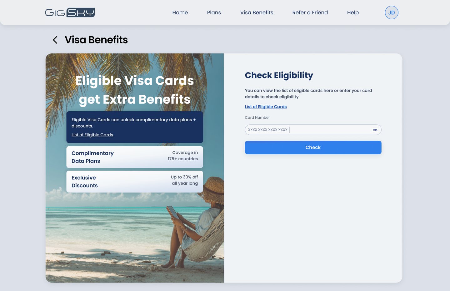
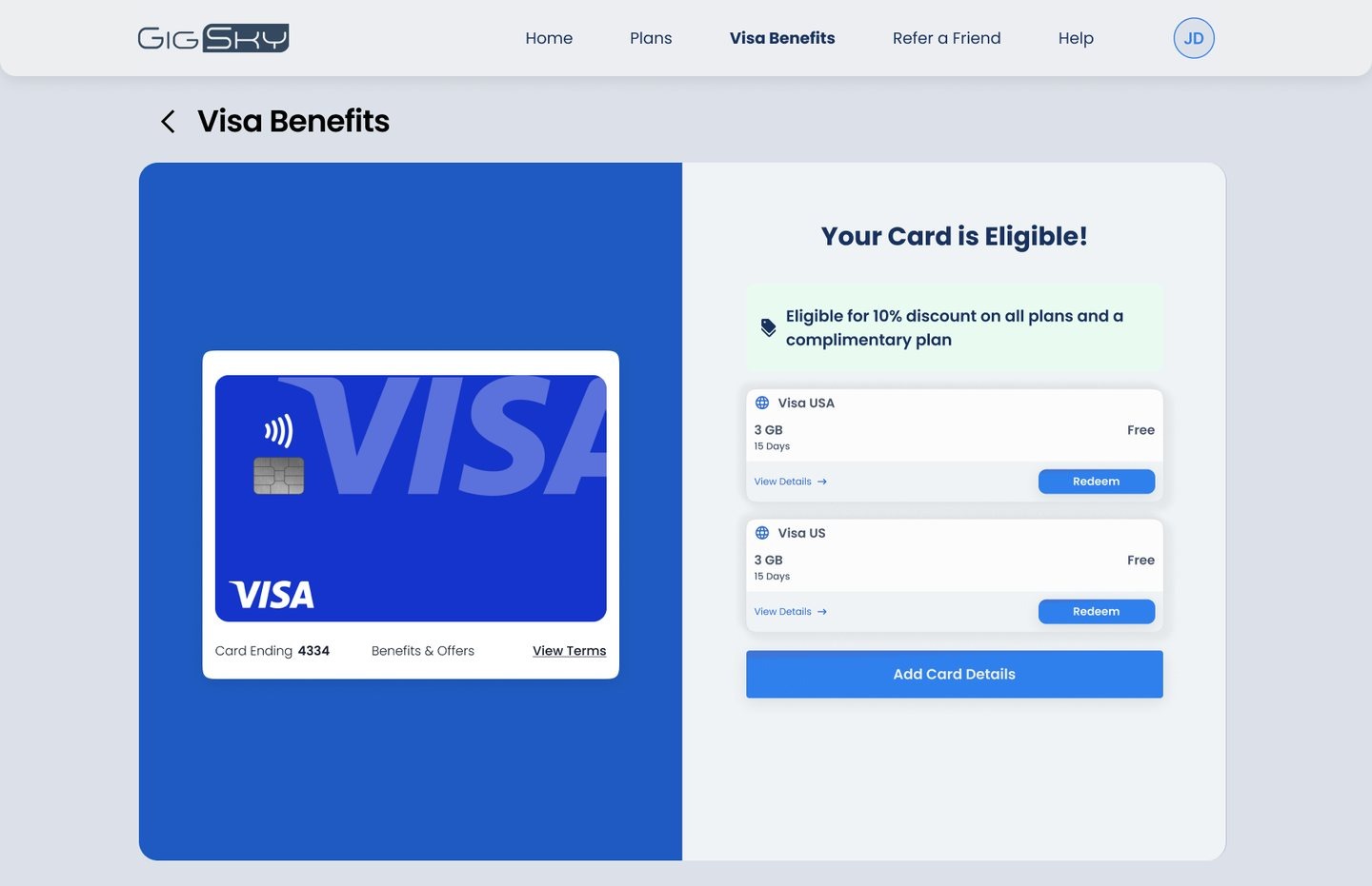
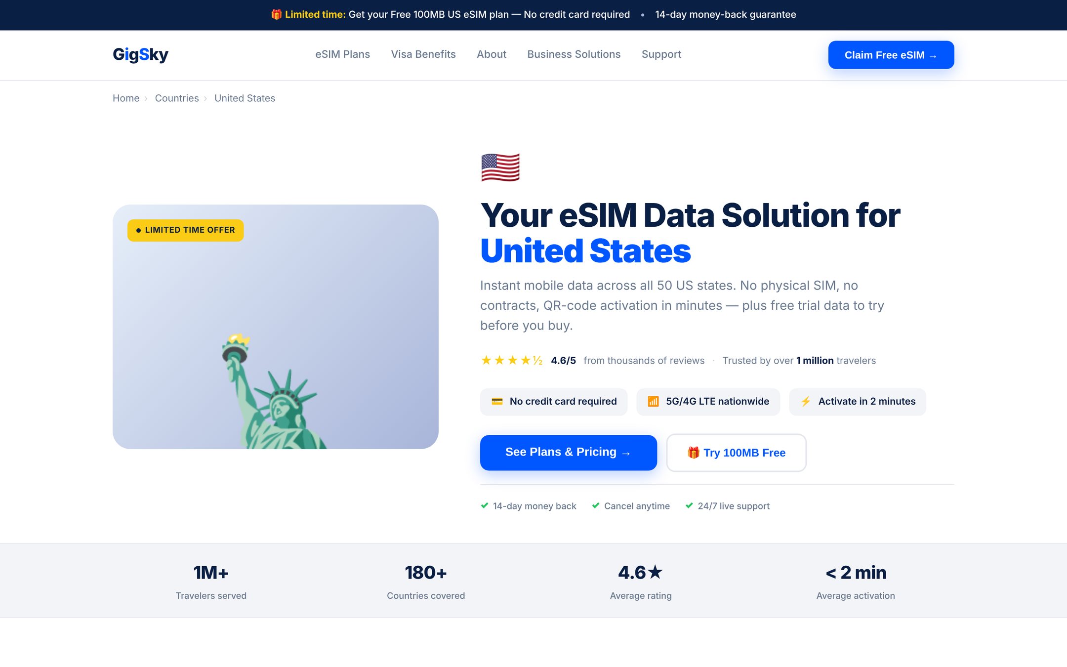
The Visa partnership gave cardholders free data, but nobody knew it existed and the terms differ by card. On the web, the Visa Benefits page leads with what you get and who qualifies, and only then asks for a card. The result reads at a glance in a two-panel layout: the card on the left, the state and the actions on the right. We kept revising the page after launch as we watched where people stopped: the order of the message, how early the form appears, how the eligible state presents the plans.
Design decision 2
Making Eligibility and Redemption Feel Simple
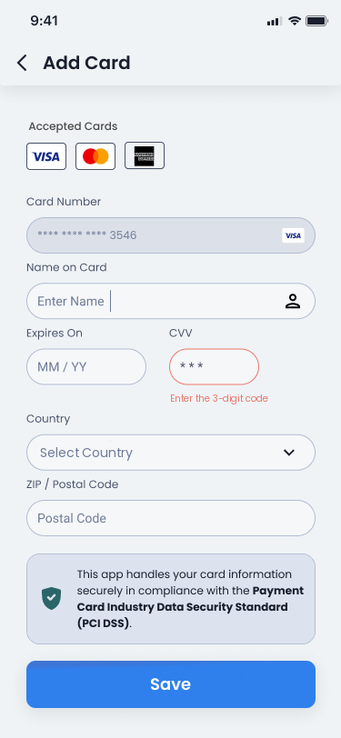
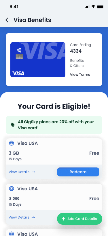
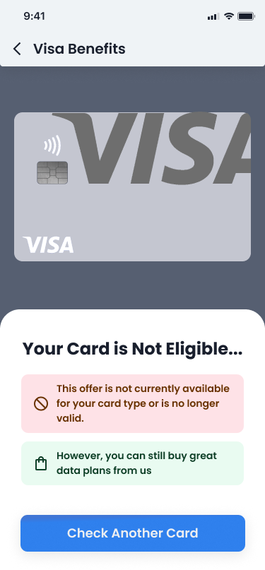
In the app, three screens carry the whole claim: add the card, see the answer, redeem. The ineligible state is the one most people see, so it was designed as a sales page rather than an error: it says why, says data is still for sale, and offers to check another card instead of stopping. The flow was revised after launch as the benefit opened to more regions and more cards, without the three-screen shape changing.
Design decision 3
Iterating the Plan Picker Until the Data Agreed
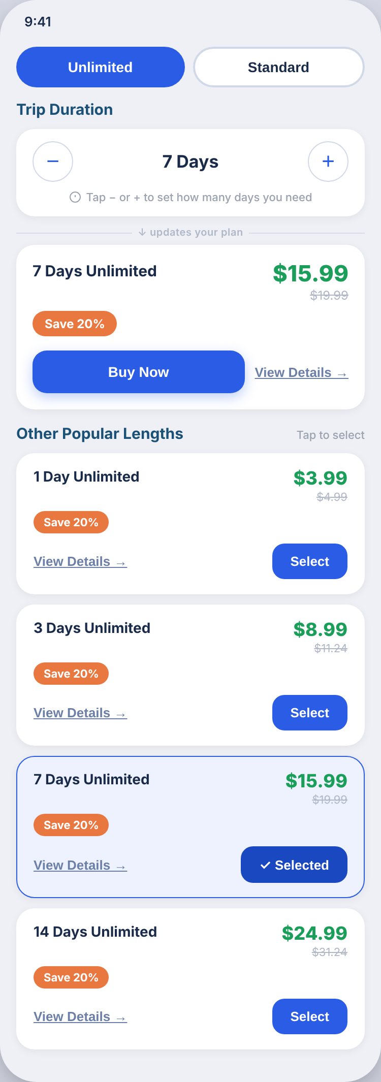
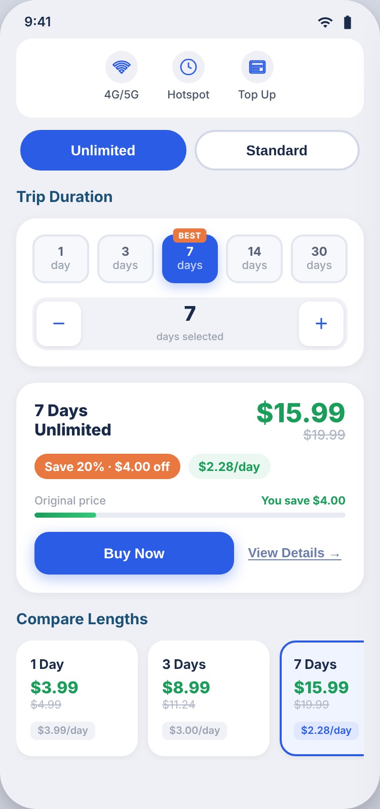
The plan picker is where a traveler decides how much to buy, in the app and on the country pages where search traffic lands. The original was a minus-plus stepper and a list. I redesigned it in rounds: chips for the common lengths, the stepper for the rest, and the price per day so a longer plan's value is visible without a discount. The pages around it were A/B tested, the picker went through several versions before this one, and the same three-step choice, coverage, plan type, days, moved to the top of every country page.
Outcome and reflection
What Shipped and What I Learned
The Visa benefit shipped in the GigSky app and expanded to Visa cardholders worldwide in May 2026, claimed entirely inside the flow above. The plan picker shipped to the app and marketing. Around them, two and a half years of iterative work: country pages and the configurator, the blog revamp, cruise flows, three rounds of App Store screens, partner and gift card pages, and ads in every Meta and Google size, most of it shipped in rounds and revised on what we saw.
The biggest takeaway: on a small team, the designer is also the research function. Being the one person across every surface meant I could take what a landing page test showed and apply it to the app, the App Store and the ads the same week, and that loop did more for the product than any single redesign would have.
Test results and adoption figures belong to GigSky and aren't reproduced here. The worldwide expansion is public: Milelion, May 13, 2026.
Interested in talking through this project?